About
Cycling Weather app
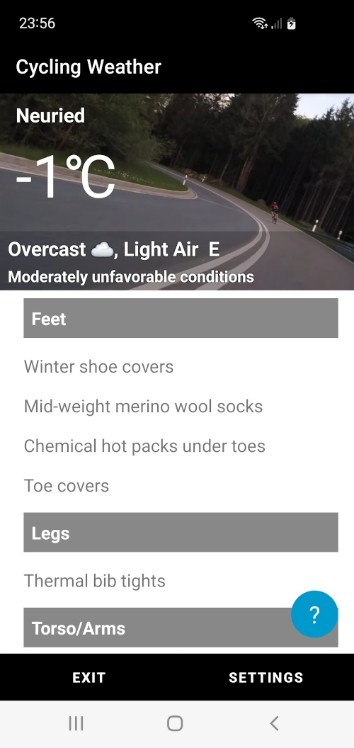
This innovative weather forecast application is specifically designed for cyclists, offering a detailed weather outlook and personalized clothing suggestions to ensure maximum comfort during your rides.
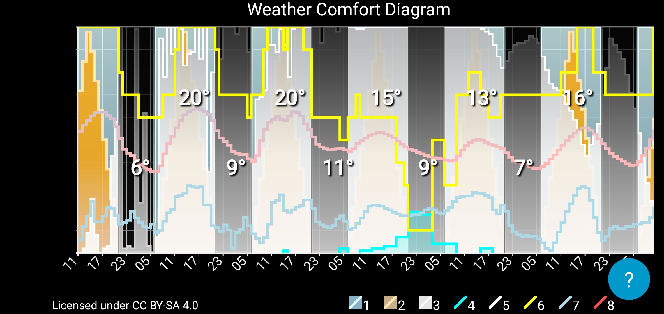
The app provides a unique Weather Comfort Diagram (weacodi), which illustrates the weather forecast, the comfort levels for cycling over the next few days and a list of recommended clothing to wear based on the current weather conditions, ensuring that cyclists stay comfortable no matter the forecast.
With this diagram, cyclists can easily determine the best times to ride based on the weather conditions, helping them plan their training sessions effectively. The diagram is simple to read and doesn’t require any specific units of measurement, offering a clear and intuitive overview of the weather conditions.
Download WeaCoDi User Manual in pdf.

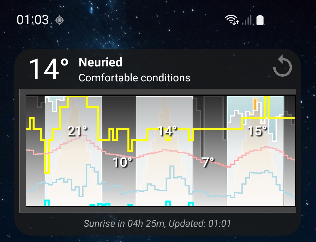
Weather Comfort Diagram
Short name: Weacodi™. Phonetic transcription: /wiːˈækədi/.
Ease of Perception: The main goal of the diagram is to provide the user with weather information without the need to read numerical values, which significantly simplifies decision-making regarding training or trips.
Combination of Graphs: The diagram consists of a set of combined graphs, which allows integrating various weather data into a single image, making it easier for the user to perceive.
Absence of Numerical Values: The diagram does not use numerical values, making it intuitive and accessible for users without specialized training.
Relative Values: The values on the Y-axis are relative and help the user quickly understand how comfortable or dangerous the weather conditions are without delving into details. The diagram consists of a set of combined graphs that display various weather parameters throughout the day. The Y-axis of the diagram reflects relative values answering the question, "How much? Is it maximally possible or not at all?" This allows visualizing different aspects of the weather without the need for specific numerical values. The X-axis of the diagram reflects time.
Visual Representation of Weather Conditions: The diagram displays various weather parameters, including sky, sun, cloudiness, rain, snow, as well as the calculated comfort level, providing the user with a comprehensive view of the weather conditions.
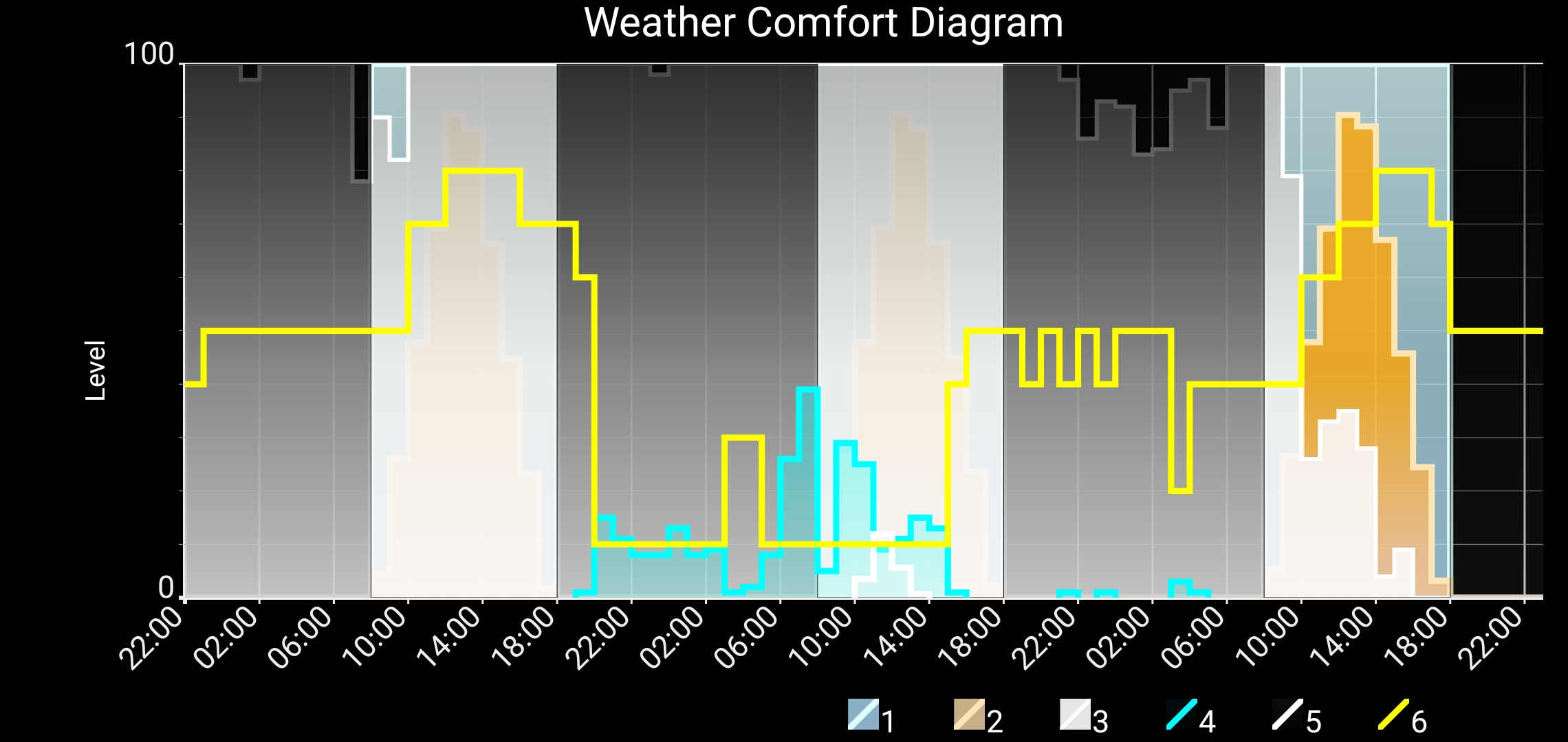
The diagram displays the following data (see picture):
- Day – displayed depending on the time of day (1).
- Night – displayed depending on the time of day (black color area).
- Sun – the amount of sunlight, taking the time of day into account (2).
- Clouds – shows the presence and density of clouds, from a few clouds to a complete overcast (3).
- Rain – displays the presence of precipitation, including the probability and intensity of rain (4).
- Snow – displays the presence of snow, including the probability and intensity of snowfalls (5).
- Calculated comfort level (optional) – determined based on weather conditions, taking into account the time of year, showing comfort for cycling and training depending on the current conditions (6).
- Other relative values, for example, wind speed, where the maximum value "very windy" and minimum value "no wind at all" are relative and depend on the current application requirements.
Particular attention should be given to the line on the graph representing the "comfort level." This parameter is calculated using a unique algorithm that takes into account all weather data, including the sun, cloudiness, rain, and snow, as well as seasonal changes. The maximum comfort level means "very comfortable," the minimum means "absolutely uncomfortable, dangerous," and the average means "normal comfort level."
With this diagram, the user can instantly get an answer to the question: "Is the weather comfortable?" without the need to read numerical values. This simplifies the decision-making process of whether it’s worth going for a walk, training session or a ride.
In the example Weacodi below, we can see that it's currently night. Tomorrow will be a good day, though there will be no sunshine. Rain is expected overnight and will continue into the morning. The following day will bring both rain and snow. However, after that, a beautiful sunny day will follow.
For more information about Weacodi please visit WeaCoDi website: (https://weacodi.com) .
Get in Touch

Hello!
I develop applications for personal use and share them online because they might be useful to you. Feel free to reach out if you have any questions or feedback.
Thank you very much to everyone who reached out to report bugs or suggest improvements. You've given me the motivation to keep the development process moving forward. Seeing how many people use the apps fuels my drive to keep going—it's like climbing a mountain: when you know the summit is within reach and you have friends supporting you, you find the strength to push on.
Alexej
- cyclingweatherforecast@gmail.com